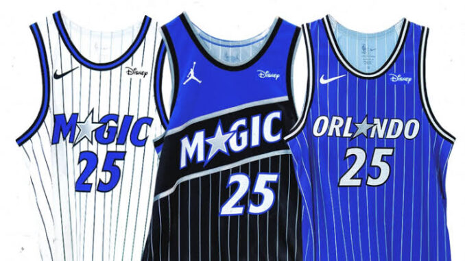
The Story Behind the Orlando Magic’s New Look
In the ever-evolving landscape of professional sports, branding plays a crucial role in how teams connect with fans, stand out in the marketplace, and reflect their identity. For the Orlando Magic, one of the NBA’s most recognizable franchises, a recent change in logo has sparked curiosity, excitement, and even a bit of controversy. But what’s the real story behind this bold redesign?
A Legacy of Identity
Since their inception in 1989, the Orlando Magic have sported a logo that blended whimsy and dynamism — a basketball streaking like a shooting star, accompanied by playful, magical typography. It was unique, vibrant, and unmistakably tied to the team’s early years, including the Shaquille O’Neal and Penny Hardaway era that catapulted the franchise into national attention.
Over the years, subtle changes were made, but the essence of the logo remained familiar. That is, until now.
Why Now?
According to team executives, the logo change is part of a larger rebranding initiative aimed at modernizing the franchise’s image while aligning it more closely with Orlando’s growing cultural and economic profile. As the city becomes a hub for technology, tourism, and innovation, the Magic wanted a visual identity that reflects this forward momentum.

“We’re proud of our history, but we’re also looking toward the future,” said the team’s Chief Marketing Officer in a recent press release. “The new logo is sleeker, more refined, and built for the digital age.”
Design with Purpose
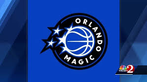
The updated logo retains key elements — such as the basketball and celestial theme — but presents them with sharper lines, a bolder font, and a minimalist color palette. This change not only streamlines the visual for use across social media, merchandising, and broadcast graphics but also symbolizes a franchise that’s maturing and evolving.
Design experts consulted for the rebrand emphasized the importance of maintaining tradition while embracing change. “We didn’t want to erase history,” said one designer from the branding agency involved. “We wanted to honor it — while making sure the look resonates with today’s fans and platforms.”
Fan Reactions
As with any redesign, reactions from fans have been mixed. Some longtime supporters lament the departure from the nostalgic charm of the original logo, while others welcome the modern aesthetic as a sign that the team is serious about its future — both on and off the court.
Social media has been abuzz with comparisons, critiques, and even fan-made remixes of the new design. Yet, overall, the move appears to be gaining acceptance, particularly among younger audiences.
Looking Ahead
The new logo is more than just a visual update — it’s a signal of transformation. As the Orlando Magic look to build a competitive roster and re-establish themselves as playoff contenders, the rebrand serves as a statement of ambition.
Whether you’re a longtime fan or a newcomer to the team, the new look invites everyone to be part of the next chapter in Magic history. Because in Orlando, the magic is still very much alive — it’s just wearing a sharper suit.
Leave a Reply